If you want to see my write up on last night's "So You Think You Can Dance" you can find it here.
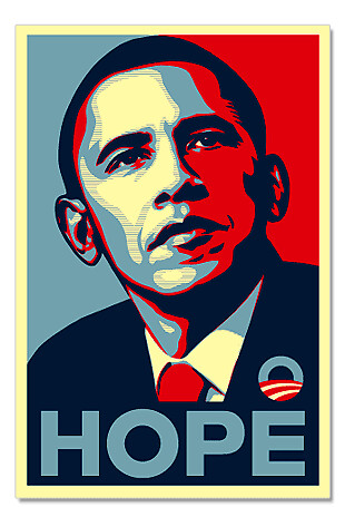
You may think that I'm for Barack Obama simply because I'm under 30, from Chicago and have my master's degree but that's not true. It's because his artwork is so much better. Compare this:

to the t-shirt designs on Hillary's site.

too many words.

colors that no one without a vagina would wear.

EXTRA too many words, with a bad font, plus an image of her that sort of looks like she's peeing on something.

Shouldn't Florida and Michigan be on the back of the shirt or something?
Finally, this one:

This one actually I kind of think is funny in that it reminds me of this:

Except the sad thing is that both the bikini and the business suit look a little snazzier than the real thing. Oh well. Please don't take my critique the wrong way, Hillary fans. I'm the kind of person who secretly finds this funny so I am not to be trusted.
